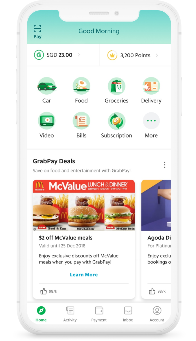
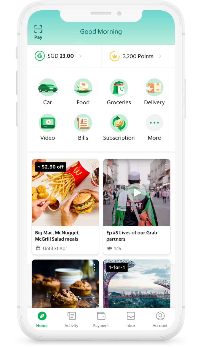
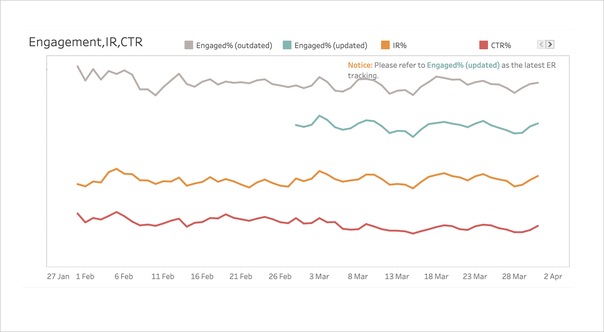
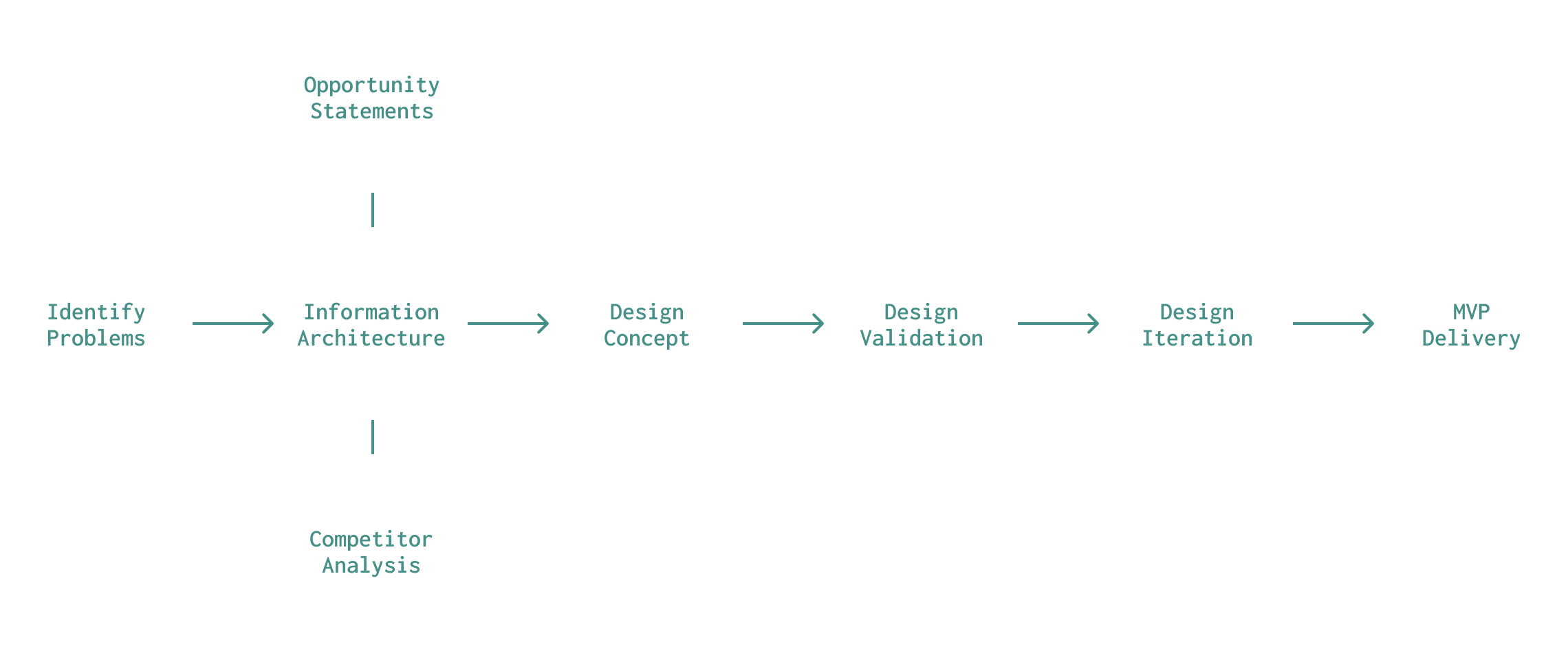
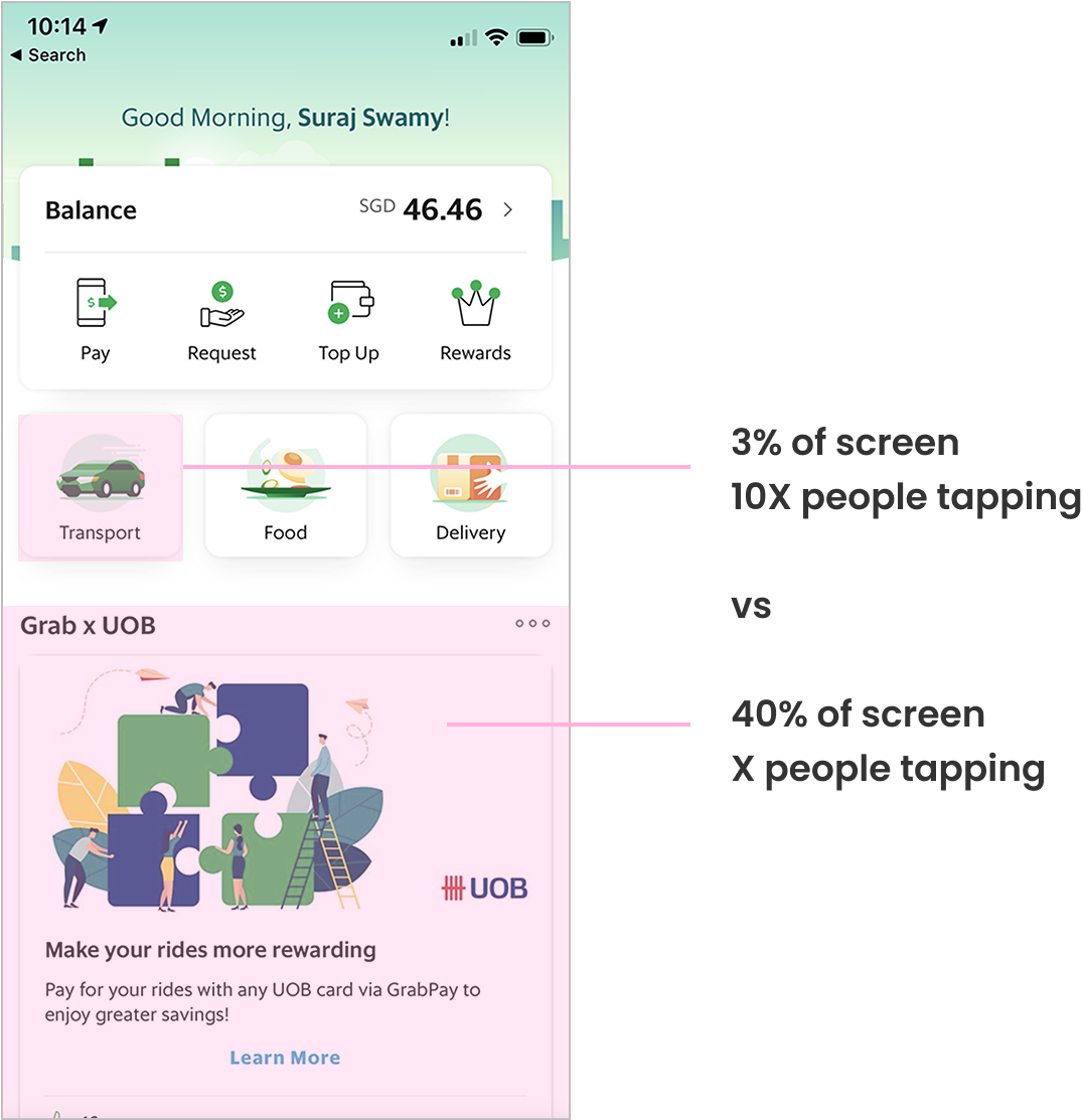
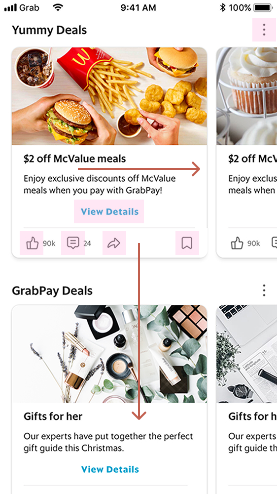
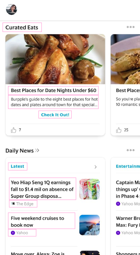
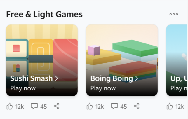
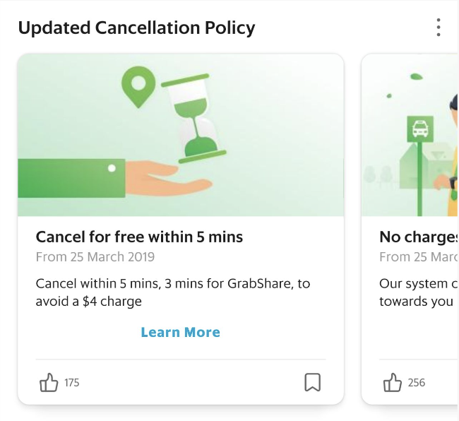
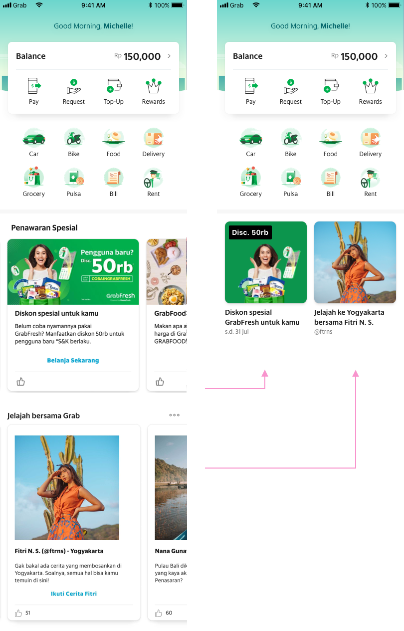
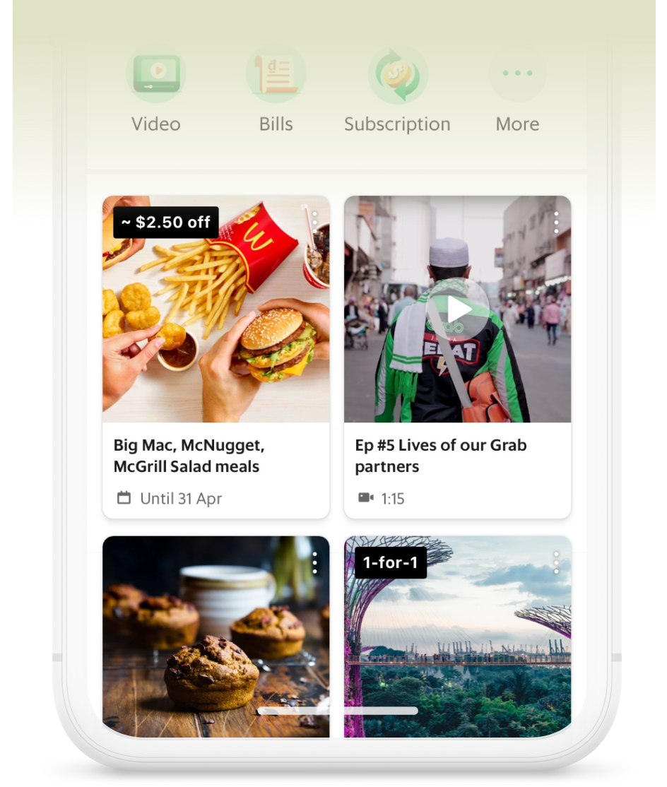
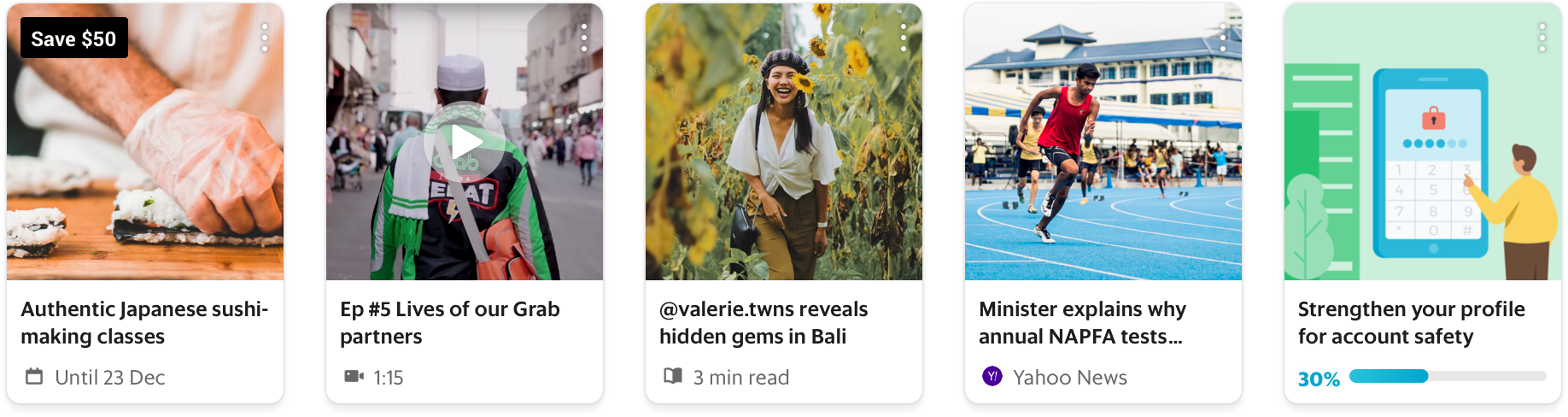
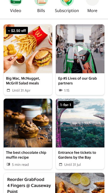
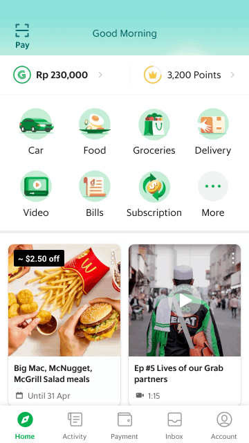
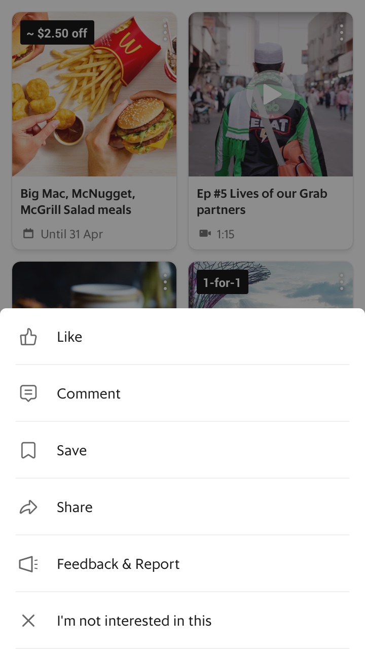
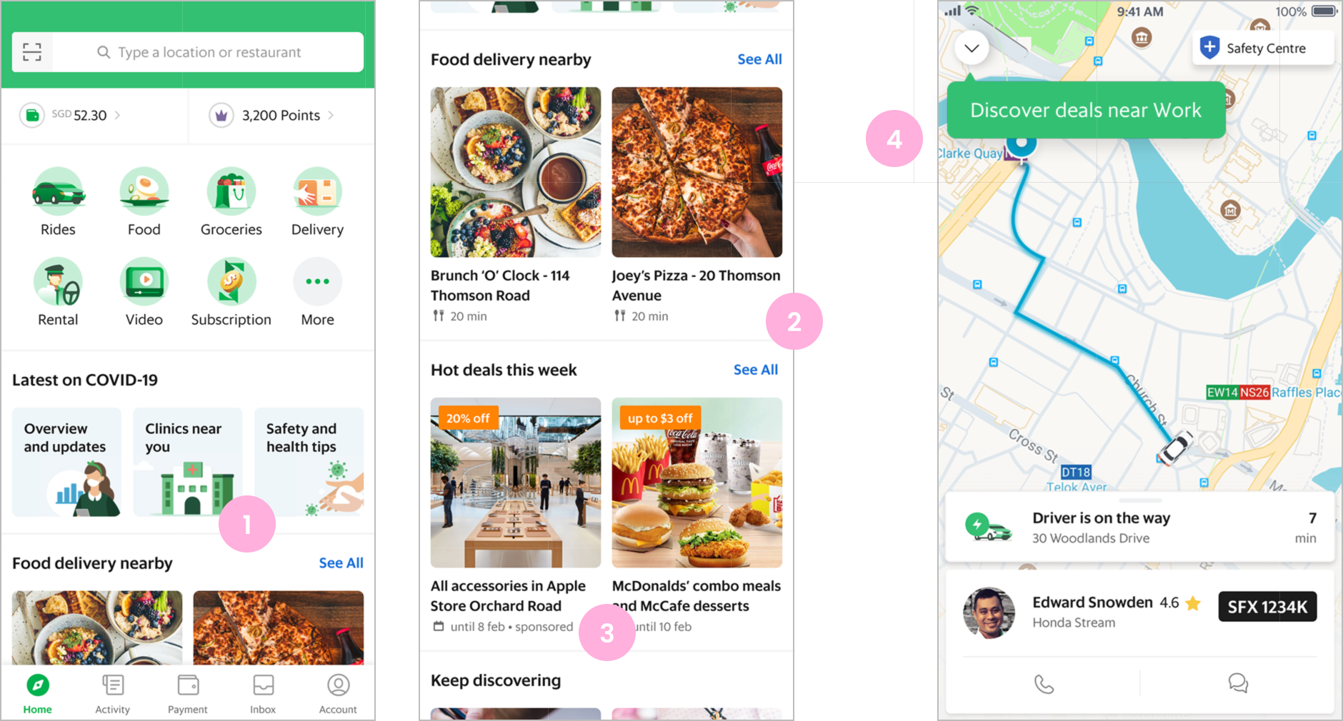
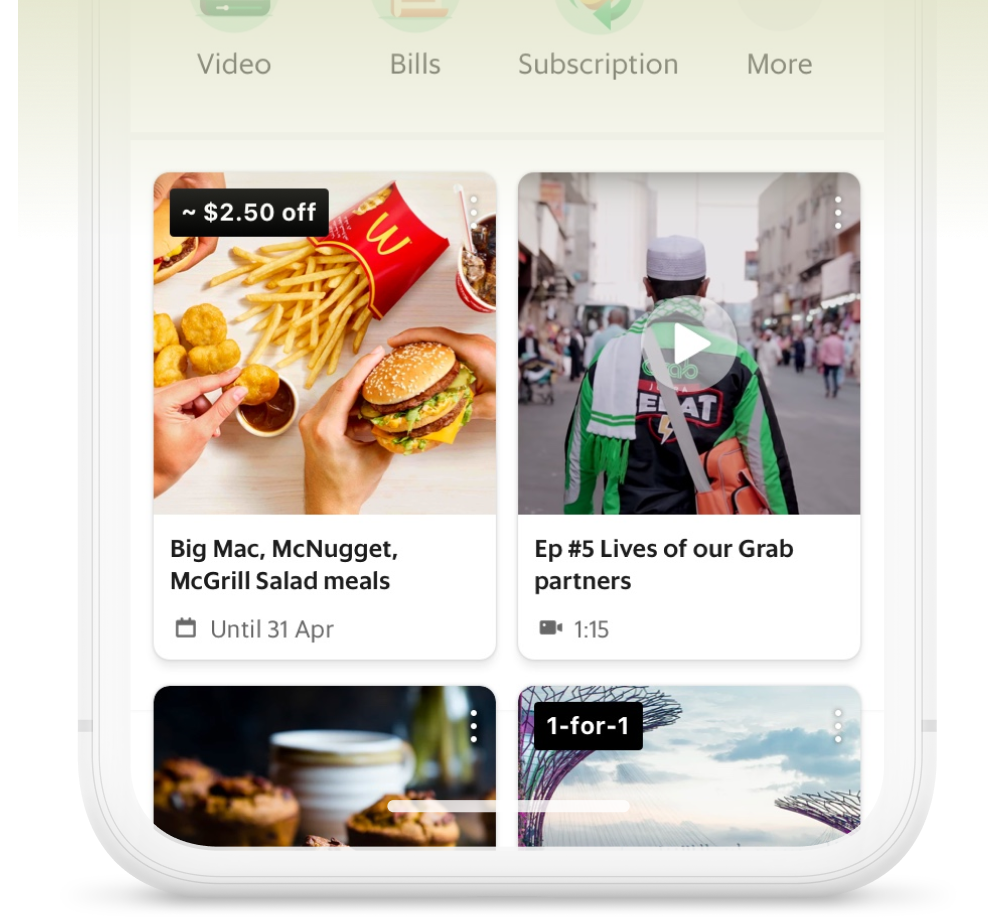
Grab has transitioned from a single service to super-app and seeks to present more opportunities for user engagement via the home screen Feed. However, the Feed is far from ideal - it’s unstable, irrelevant and ignored by many users. This case study outlines how I identified the fundamental problems and in turn, drove a redesign of the Grab Feed.
Lead Designer
I initiated and led the redesign from high-level design strategy to UX deliverables of both frontend mobile and web CMS
1 designer, 1 product manager, 1 ux researcher, team of engineers
Apr - May 2019
Design strategy, usability testing, MVP design delivery
Jun - Nov 2019
Development, A/B tests analysis
Dec 2019
100% rollout
iOS, Android
8 countries across Southeast Asia
Mid-2018, a brand new home screen was launched as Grab transitioned from a transport to super-app.
The Feed, originally built as a sandbox experiment, was moved into our home screen team in 2019.
My role as the newly appointed designer was to lead feature work to increase User Engagement Rate (ER), driven by the hypothesis:
”If we could keep the user engaged for longer or more times in the app, we could derive more opportunities for transaction.”
3 months of feature work later, the ER still had no significant change.
I had participated in deep user researches, analysed a/b tests and competitor apps, and thought we should stop building on top of a bad foundation.
This sparked my initiation of the Grab Feed Redesign.
Our market resides in Southeast Asia, with many users not having access to high-speed internet.
In Indonesia, the web-view Feed could take up to 60s to load, resulting in some users thinking “Grab app is slow, I’ll use another app” (verbatim)
There were at least 7 different ways to interact with the Feed.
This was based on the hypothesis “more interaction opportunities leads to more engagement,” but in reality users found it distracting and hard to navigate.
In a single screen view of the Feed, users have to process so much information.
“I never read the text… too lazy to read”
“I usually just look at the pictures”
(user research verbatim)
The Feed offers at least 9 categories of content, with the intention of having something for everyone, but in reality users find it irrelevant and subsequently ignore the Feed.
To break it down simply, the Feed has 3 levels:
Surface (eg. Card)
Detail (eg. Page)
Transaction (eg. order food)
I identified the user’s mentality at each level to determine what the UI should focus on.
* This project scope was largely focused on level 1, with some consideration for level 2.
Since there are many types of content in the Grab Feed, I looked at them individually to determine what is the most valuable information that should appear on level 1.
This mini deck is an example of my thinking process behind Deals.
To take a holistic view of the current app, I initiated and led a card sorting workshop involving over 30 different stakeholders.
The goal was to figure out what content belonged on the Feed, or where instead in or even outside of the app they should go.
Groups of 5 were given a list of 40 use cases and the exercise was broken into 3 steps:
1. Think like a user - As a user, where would I expect to find this?
2. Derive user’s mental model and motivations behind step 1 - As a user, I want to achieve X
3. Think from Grab’s perspective - What business metrics could be used to measure the success of each screen/section?
Simplified interactions are similar to current social media apps and overall feed is perceived to load faster
The mosaic-style UI we tested was confusing for some users, they “don’t know where to focus on”
Users are conscious of their data consumption and perceive carousels in the current Feed to be data-heavy
“I never read the info anyway, I just tap on any promo I see”
To quickly validate the new feed UI, we hacked the current Feed to run a low-cost A/B test.
Experiment Setup
Countries: ID, TH
Duration: 30 days
Rollout: 50 variant-50 control, 4% user
Control: Pinned-to-top set of 5 widgets that have historically performed well in existing layout
Treatment: A pinned-to-top selection of 10 most engaging cards (=5 widgets) in new layout
Results
Engagement Rate +42%
Click-Through Rate +6%
Besides the frontend mobile experience, I was also responsible for the Feed CMS design.
Content and marketing managers across our 8 country markets would create cards for the Feed. I took initiative to create a detailed guide on how to use the new CMS, along with an imagery, logo and content-writing (together with a content writer) style guide.
With a solid feed foundation, we continued to experiment and improve the Feed in 2020.
1 Adapting to Covid-19
Covid-19 related content could be quickly created and released in the Feed across 8 country markets
2 Sections
By showing content on feed in sections, users can discover content that they like easily (results: sig. increase in ER, CTR & GMV)
3 Ads
External vendors could now create content for the Feed, increasing revenue
4 Cross-selling while user is in transit
Users can discover multiple Grab services on the Feed relevant to their destination
(results: sig. increase in ER, CTR & GMV)
+ Progressive UI update
Removal of ‘cards’ UI across Grab app for a clean & consistent look
Content Audit
During the redesign process, I had initiated a card sorting workshop that produced promising results, but a content audit was unfortunately out of scope for this redesign since it involved too many cross-team efforts. The goal was to pick this up again in 2020, but it was then deprioritised due to Covid-19. I still strongly believe a good content audit would increase appropriate business metrics for the Feed and by extension, the whole app!
Carousels?
In this redesign, we made the decision to not implement carousels since many users across the SEA market perceive them to be data-heavy. As we moved from a web-view to native experience, this also reduced engineering cost. However, I would've liked to be able to experiment more and analyse the impact of carousels since they help save on real estate.
Product Owner
"Hillary delivers impressive value without any prompt, but just because she realises it's the necessary next step. Her work for feed 3.0 was the clear example of this attitude. The overall project is backed up with serious analysis of user behaviour and competitors benchmarking. It was presented to the team in a clear and concise way."
Lead Engineer
"Hillary's initiative and sole ownership of the design for Feed 3.0 has been outstanding. The designs for the CMS and the client are engaging, clutter free and look to improve the existing pain points of the Feed. Her candour and eagerness to seek advice from engineering members and product team has ensured that we build features in a non-complex way and are shipped on time."