Overview
With the Covid-19 pandemic, Grab has entered a new normal of customer behaviours. This case study outlines how we optimised the home screen to enable users to achieve their tasks easily, and discover relevant on-demand commerce content.
Role
Team of 3 designers - design exploration phase
Lead designer - experimentation & MVP delivery phases
Timeline
June 2020
Design exploration, usability testing
July - Aug 2020
A/B test experiments, design iteration, MVP delivery
Launch
iOS, Android
8 countries across Southeast Asia
↑ service adoption
↑ average product holdings
↑ gross profits
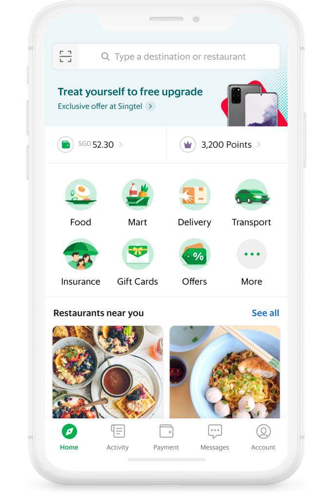
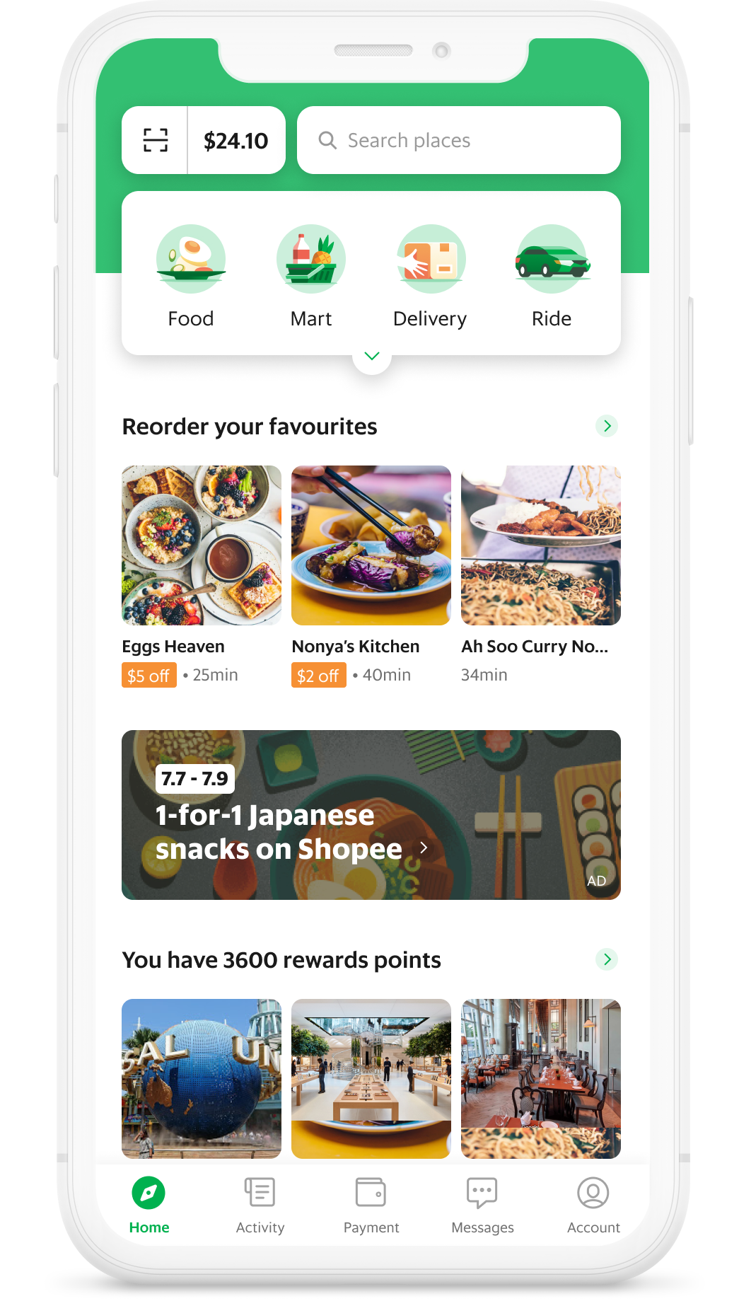
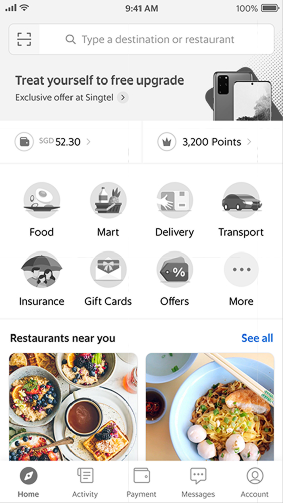
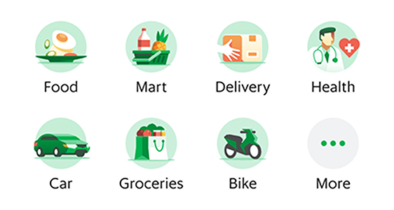
old
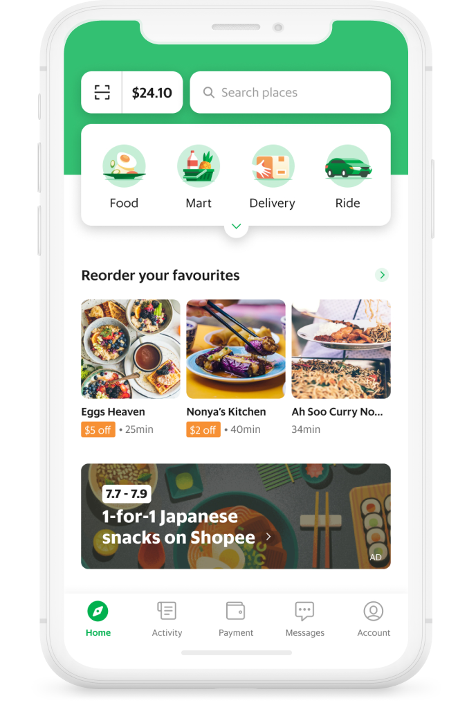
new home screen
BACKGROUND
A New Normal
With the Covid-19 pandemic, Grab is entering a new normal of customer behaviours.
What used to be our primary service, Transport, now sits on the sideline as people are staying home.
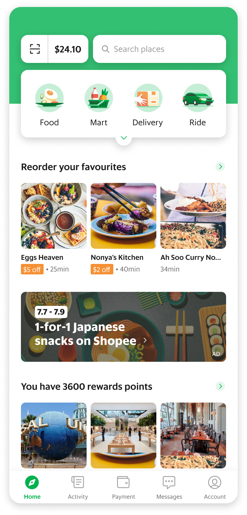
There is a need to pivot from optimising core service experiences to enabling users to discover on-demand commerce, content such as food and mart delivery, on the home screen.
Why is the current home screen ineffective?
business problem
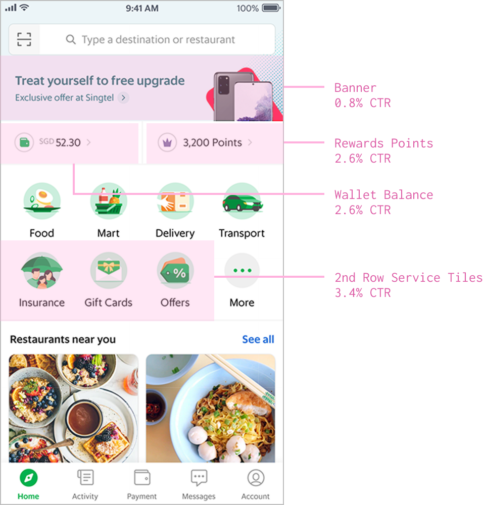
High Visibility, Yet Low Performance
Despite being on the top half of the homepage, multiple elements such as the banner, grabpay balance, rewards points and second row of service tiles perform poorly (measured by CTR & GMV attribution) and even worse than the Feed located at the bottom half.
business problem
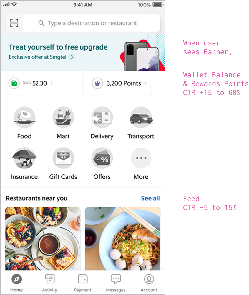
Bizarre Effects Of The Banner
The low performing Banner has interesting, unintended effects whenever it is shown:
1. Wallet Balance and Rewards Points increase in CTR → the Banner is drawing attention to elements around it rather than itself
2. Feed CTR significantly decreases → Banner has a cannibalisation effect on the Feed
customer problem
Users Don’t Understand The Value Of New Services
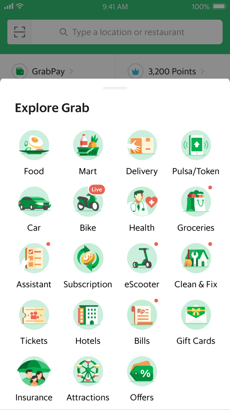
Existing menu of all services when user taps on “More” tile
Whenever a new service is introduced, it is simply presented as a "tile" consisting of an icon + name.
The lack of a value proposition make it difficult for users to understand the new services, therefore they are not enticed to try them out.
customer problem
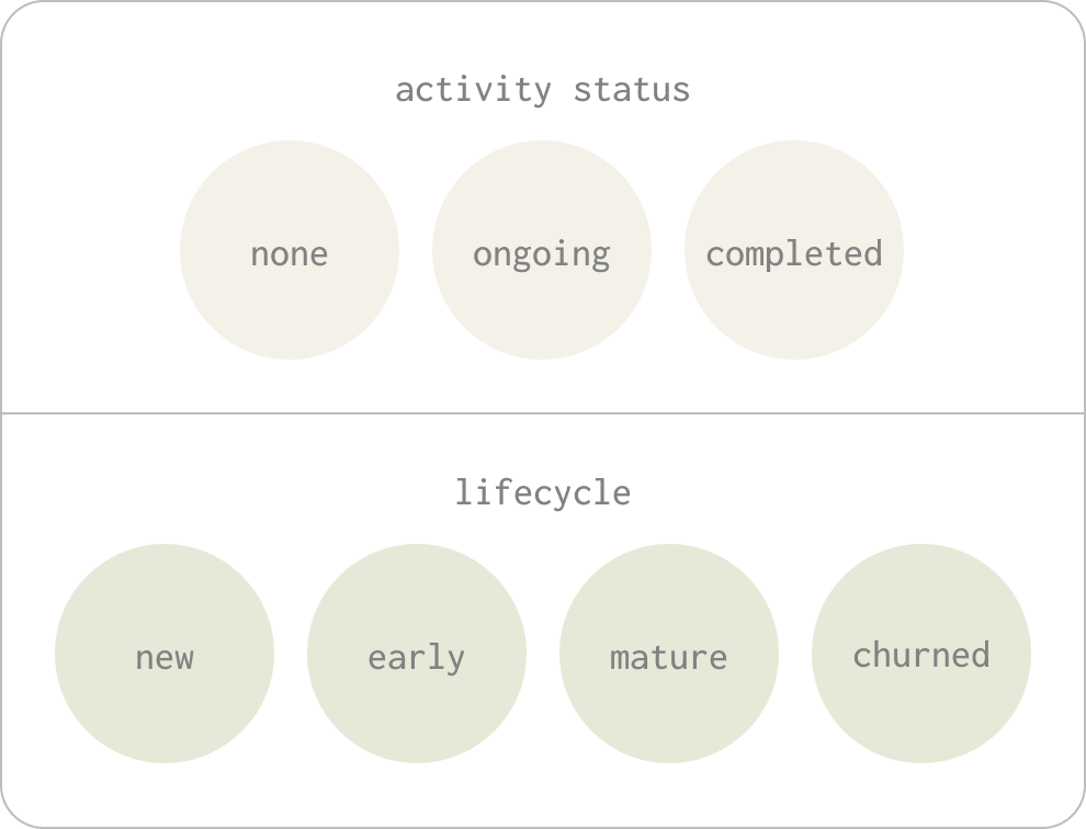
Home Screen Content Is Not Contextual
Whenever we analyse user behaviours, we break them down into groups based on user status or lifecycle.
However, the content on the home screen remains the same for all users despite their differing needs.
research insights
What We've Learned So Far
data analytics
A. There is a causal effect of Feed on GMV
Users who interact with Feed tend to spend more. The Feed has an overall positive impact on net GMV/user by 6-15% regionally.
Feed refers to the content located at the bottom of the home screen
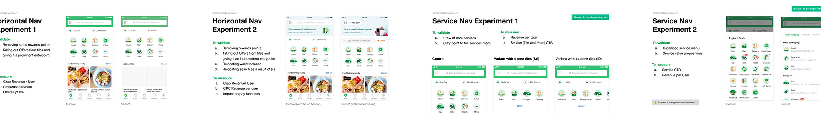
a/b testing
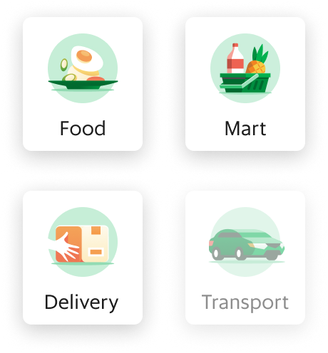
B. One row of Tiles increases Feed CTR
Hiding the second row of service Tiles led to no significant change to GMV per user, but a 34% increase in Feed CTR.
Experiment Control - 2 rows of tiles
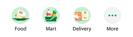
Experiment Variant - 1 rows of tiles
user research
C. List view of Tiles make it easier to discover new services
“This is easier for me to browse through, I didn’t realise before that Grab had so many useful things for me to use!” (user verbatim)
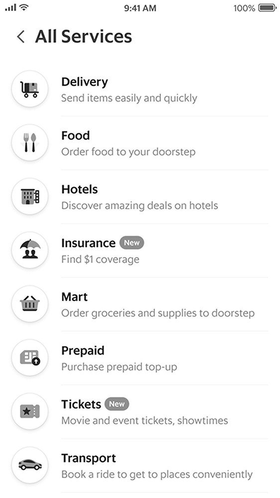
Hi-fi wireframe of full service menu tested with real users
user research
D. Users expect to see wallet balance when they open the app
In past research, users have always highlighted that the wallet balance is important to them when they access the app.
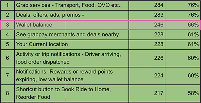
User survey top results on “things I want to immediately see or access when I open Grab app”
PRODUCT VISION
01
Make it easy for customers to get things done
02
Facilitate instant transactions
03
Increase users trust and stickiness to the platform
04
Allow for natural adoption of Grab’s services & offerings
#transaction frequency #ad revenue #nps #conversion #retention
Data-Driven Design
Since we were dealing with multiple hypotheses, we validated different fragments through multiple A/B tests.
The design solutions you see below are the final result & iteration of the many experiments we ran.
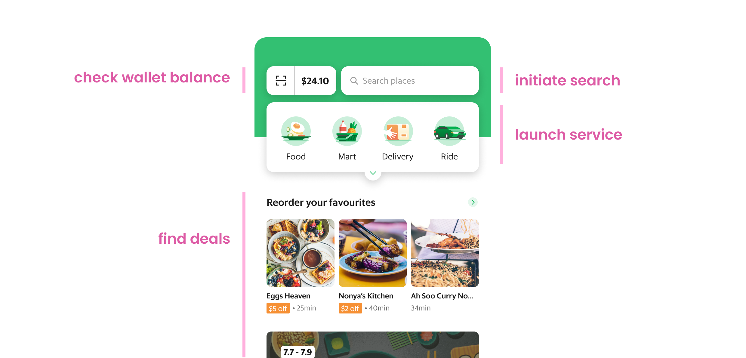
As a user, I can achieve my tasks easily
Top 4 tasks when user opens grab app
As a user, I can easily find services and understand their value.
As a user, I get recommendations contextual to my activity status and/or lifecycle.
Retrospective
This was the most fast-paced project I've been a part of, and it was a welcomed challenge while I also navigated with working from home during the Covid-19 pandemic. The design exploration phase was rapid and intense, with a review with top management twice a week.
We got a huge amount of insight from both quantitative and qualitative data that simply could not be covered within an MVP scope. Since I left the company while the MVP was being developed, I never got to see this redesign past the MVP stage and that's slightly regretful!