product design

Redefining Grab App Navigation

↑ service discovery
↑ conversion rate
↑ nps

Overview

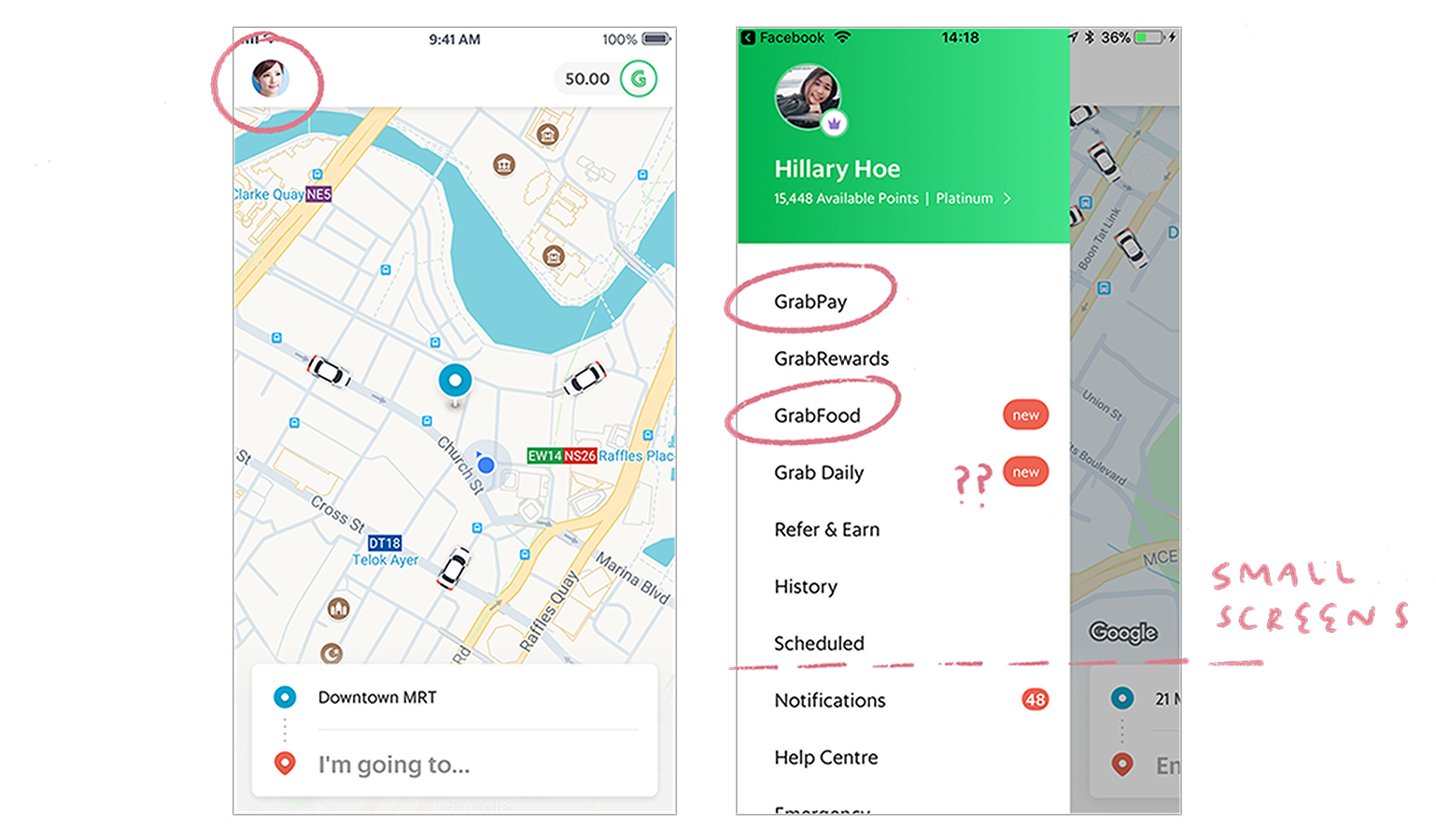
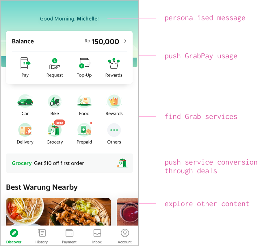
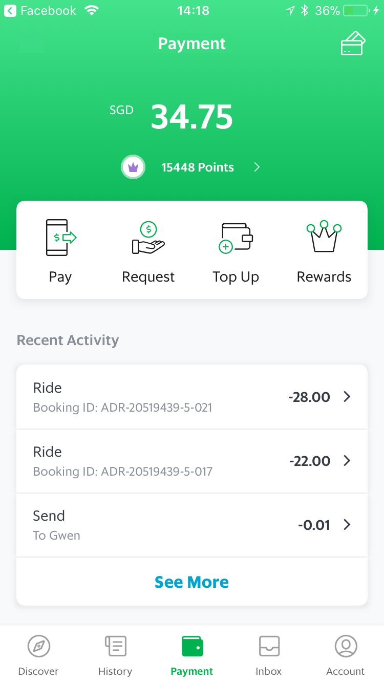
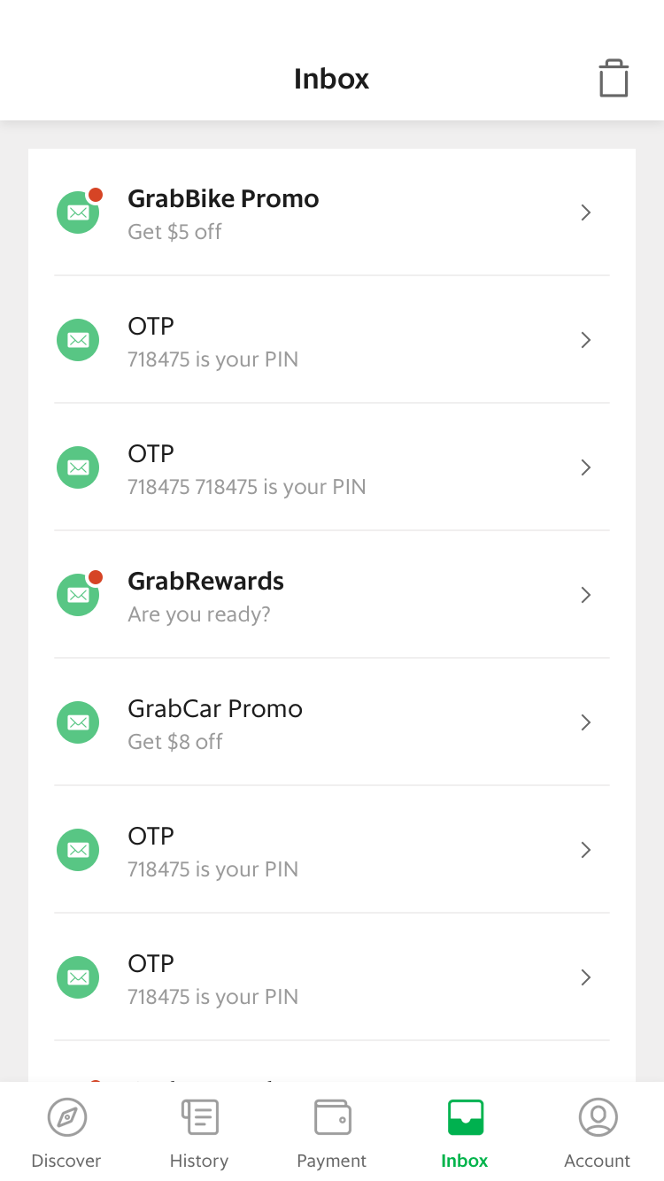
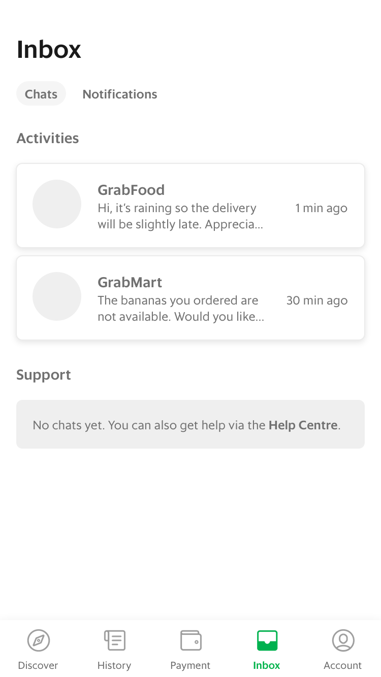
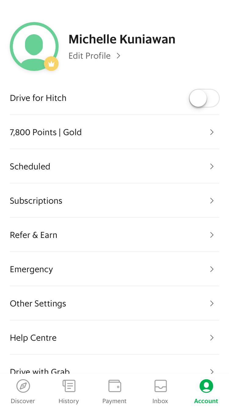
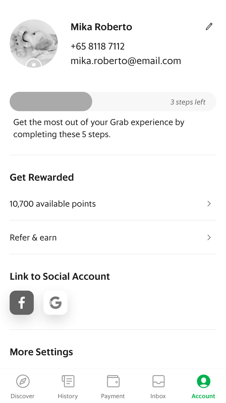
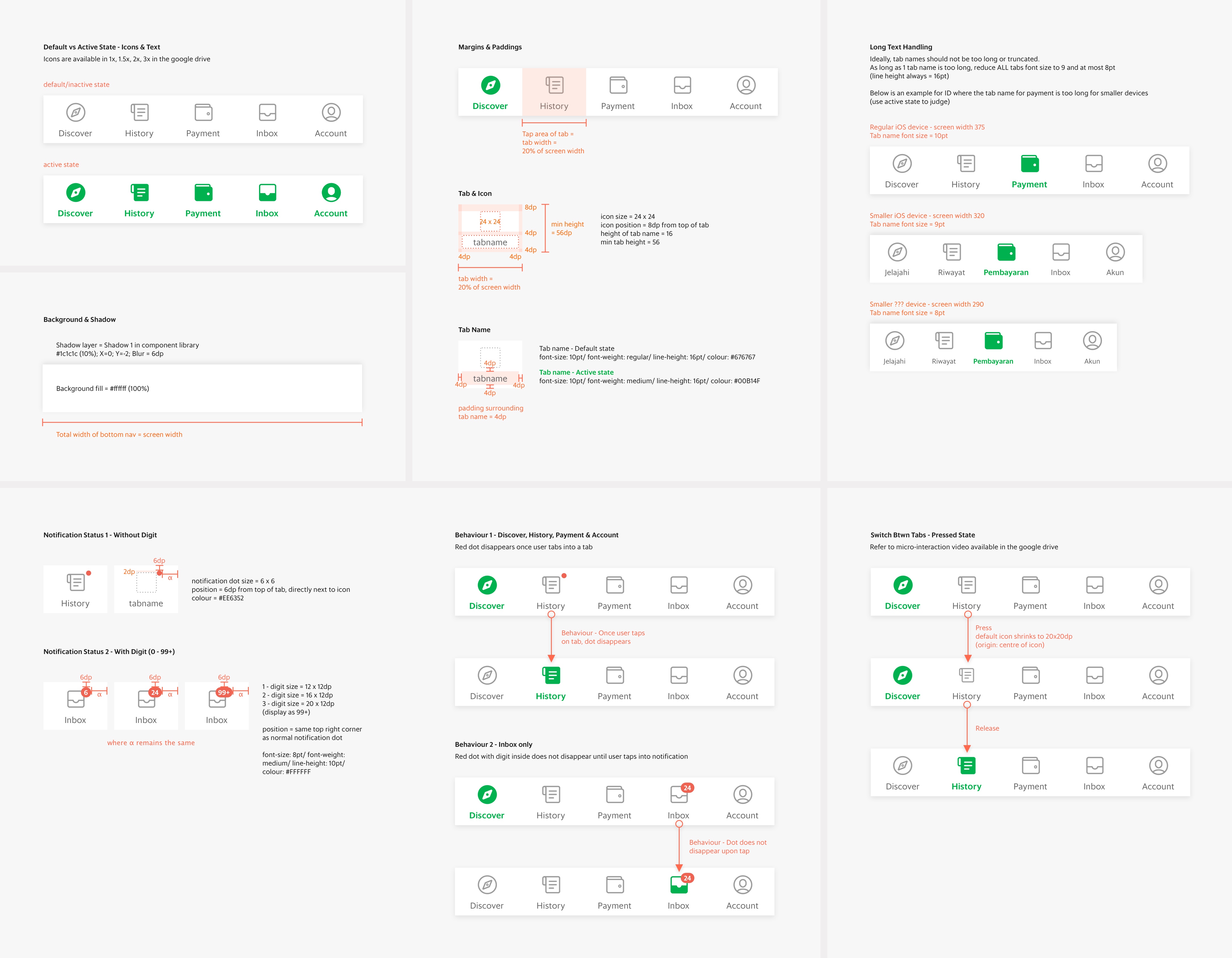
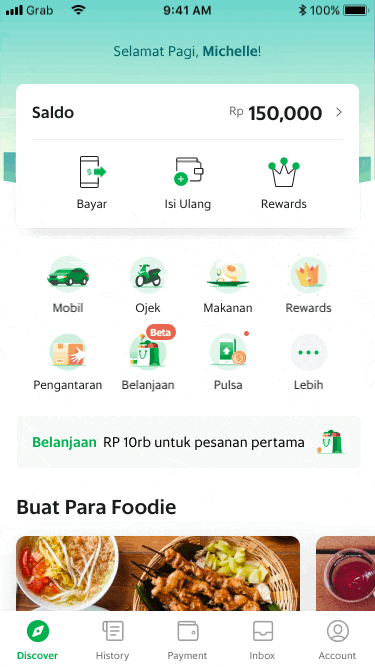
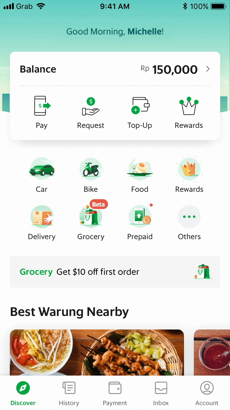
As Grab transitions from a transport to multi-service provider, the side menu has become a ‘dumping ground’ for new services and features. While we work on a new home screen for Grab app to increase the discoverability of services, we also want to redefine the overall navigation for app scaleability and improve ease of app usage.

Role

Solo Designer

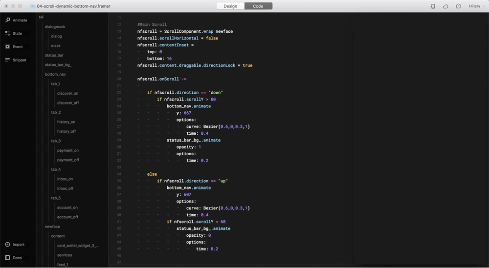
I delivered E2E UX flows, UI specs, micro-interactions and prototypes for usability testing.

Team

1 designer, 1 product manager, 1 ux researcher, 1 content writer, team of engineers

Timeline

Aug - Sept 2018
100% rollout in Nov 2018

Launch

iOS, Android
8 countries across Southeast Asia

background

One Side Menu,
Multiple Problems

01
Low discoverability of services

Main services such as GrabPay and GrabFood are hidden in the side menu, contributing to low conversion rates

04
Dumping ground

Anything new is constantly added into the side menu because there’s no other place for an entrypoint

02
Poor app organization

Different function classes (service, features, campaign) all jumbled together in side menu

05
Not scaleable for small devices

Grab has a significant % of users in SEA still using smaller screens; many of the side menu items are hidden

03
Poor thumb reachability

To open the side menu, users have to tap on icon on top left corner

user goals

“I can easily navigate and find what I want”

+

business goals

↑ service discovery
↑ grabpay usage

bottom navigation strategy

4+1 Approach

I proposed and aligned with various stakeholders on the "4+1" approach for the new bottom navigation.

4 main touchpoints or key screens, determined by an overlap of user and business needs

+ 1 account page that houses ‘everything else,’ especially important for the MVP (fast implementation at low cost)

GrabPay
GrabRewards
GrabFood
GrabDaily (feed)
1 Discover
History
Scheduled*
2 Activity
*after mvp
GrabPay
GrabRewards
3 Payment
Notifications
Support Chat*
4 Inbox
*after mvp
Profile
Refer & Earn
Emergency
Help Center
Drive for Grab
Drive for Hitch
5 Account
the +1

Naming Considerations

This would be where users land when they open the app, Grab's new home screen.

Discover vs Home
Instead of using a vague and overused name like ‘Home,’ my content writer and I chose to name this tab ‘Discover.’

This was meant to serve as a subtle psychological nudge, helping users associate the page with exploring all the various services Grab offers.

MVP - History
For MVP, this tab would only allow users to track past orders.

Orders vs Activity
The vision was a page where users could track their past, present, and future orders. Since Grab constantly introducing new services; ‘Activity’ would better encompass the wide range of services.

mvp
future

Payment vs Wallet
Through qualitative research, we found out that users typically associated ‘Wallet’ with just their balance, while ‘Payment’ conveyed a broader range of actions; the latter was therefore chosen.

! Extra Notes

GrabPay was launched earlier this same year as a mobile wallet for payments such as in-store purchases, Grab transactions and fund transfers. The redesign/new home screen was largely to push GrabPay adoption.

For MVP, this page would house only notifications.

In future, it would ideally evolve into a central hub for messages, also including chats from drivers and support from the help center.

‘Inbox’ was chosen as a versatile name that works for both designs.

mvp
future

For MVP, the Account would act simply as an entrypoint to different screens.

In future, it should ideally contain dynamic content to facilitate new user onboarding and drive existing user conversion rates.

Account vs Profile
Through qualitatative research, we found that the name ‘Profile’ limited users’ understanding of what it contained. The term ‘Account’ was more commonly understood to encompass both the user profile and other settings.

mvp
future

UI Specs & Behaviours

Bottom nav loads when user first enters app
Tap & hold behaviours
Scroll behaviour

To facilitate working with the developers, I used Framer & Flinto prototyping tools to design the micro-interactions of the bottom navigation bar.